Motion graphics prompt archive · made by Jack

The exact prompts.
The actual frames.

A working library of the image and video prompts used to build a tactile, cinematic motion-graphics sequence—preserved here with the results they produced.

15motion studies
16finished frames
31copy-ready prompts

The full sequence

From the opening question
to the final curve.

Each entry pairs the generated frame with the exact prompt text used for its image and animation. Select a prompt, copy it, and adapt only what your own sequence needs.

01

Opening question · 6 seconds

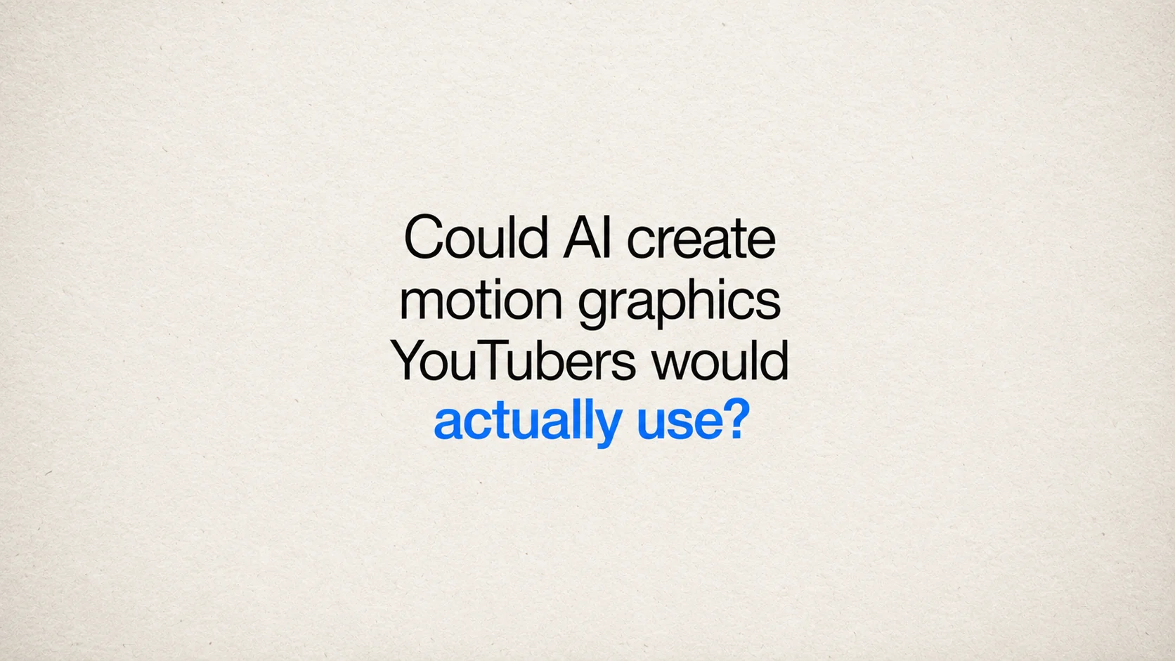
Could AI create motion graphics YouTubers would actually use?

A centered typographic hook that lets the final cobalt phrase carry the turn.
Could AI create motion graphics YouTubers would actually use title frame

Final generated frameView full size ↗

Image prompt
Create the finished 16:9 end frame for a cinematic typographic motion graphic.

Use warm white uncoated paper with visible fine fibers, a lightly toothy surface, subtle tonal variation, and occasional tiny natural flecks. Light it softly from above so the texture feels physical without looking dirty. Add fine 35mm film grain, gentle tonal roll-off, and restrained optical softness.

Set the text as four centered lines in Helvetica Neue or Helvetica: “Could AI create” / “motion graphics” / “YouTubers would” / “actually use?”. Use regular-weight near-black type for the first three lines. Set “actually use?” in cobalt blue at medium weight and approximately the same size. Keep the complete text block precisely centered with balanced spacing and substantial empty space around it.

The result should feel like the clean final state of a carefully animated title sequence for an independent film or video essay. Include no additional symbols, rules, dots, illustrations, or decorative shapes. Avoid poster styling, heavy distress, harsh vignettes, and exaggerated vintage effects.
02

Chapter title · 6 seconds

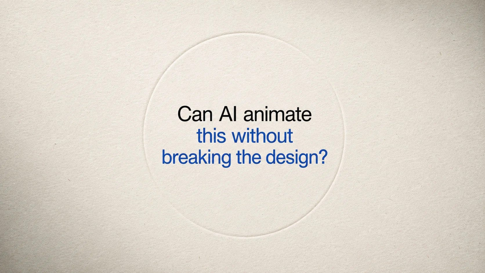
Can AI animate this without breaking the design?

A quiet debossed chapter card revealed through light, masks, and restrained scale.

Can AI animate this without breaking the design chapter frame

Final generated frameView full size ↗

Image prompt
Create the finished 16:9 end frame for a cinematic chapter title.

Use warm white uncoated paper with visible fibers, faint pressure marks, and a softly toothy surface. Add fine 35mm film grain, gentle highlight roll-off, and a small amount of optical softness. A shallow blind-debossed circle may sit behind the typography, visible only through quiet changes in light and shadow.

Center “Can AI animate this without breaking the design?” in Helvetica Neue or Helvetica across three balanced lines. Use regular-weight near-black type, with “without breaking the design?” in cobalt blue at medium weight. Keep the wording in natural sentence case and the full title compact within the center of the frame.

The frame should feel like a resolved documentary chapter card photographed on real paper. Keep the embossed circle understated and include no dash, badge, logo, interface framing, or decorative symbols.
03

Time comparison · 6 seconds

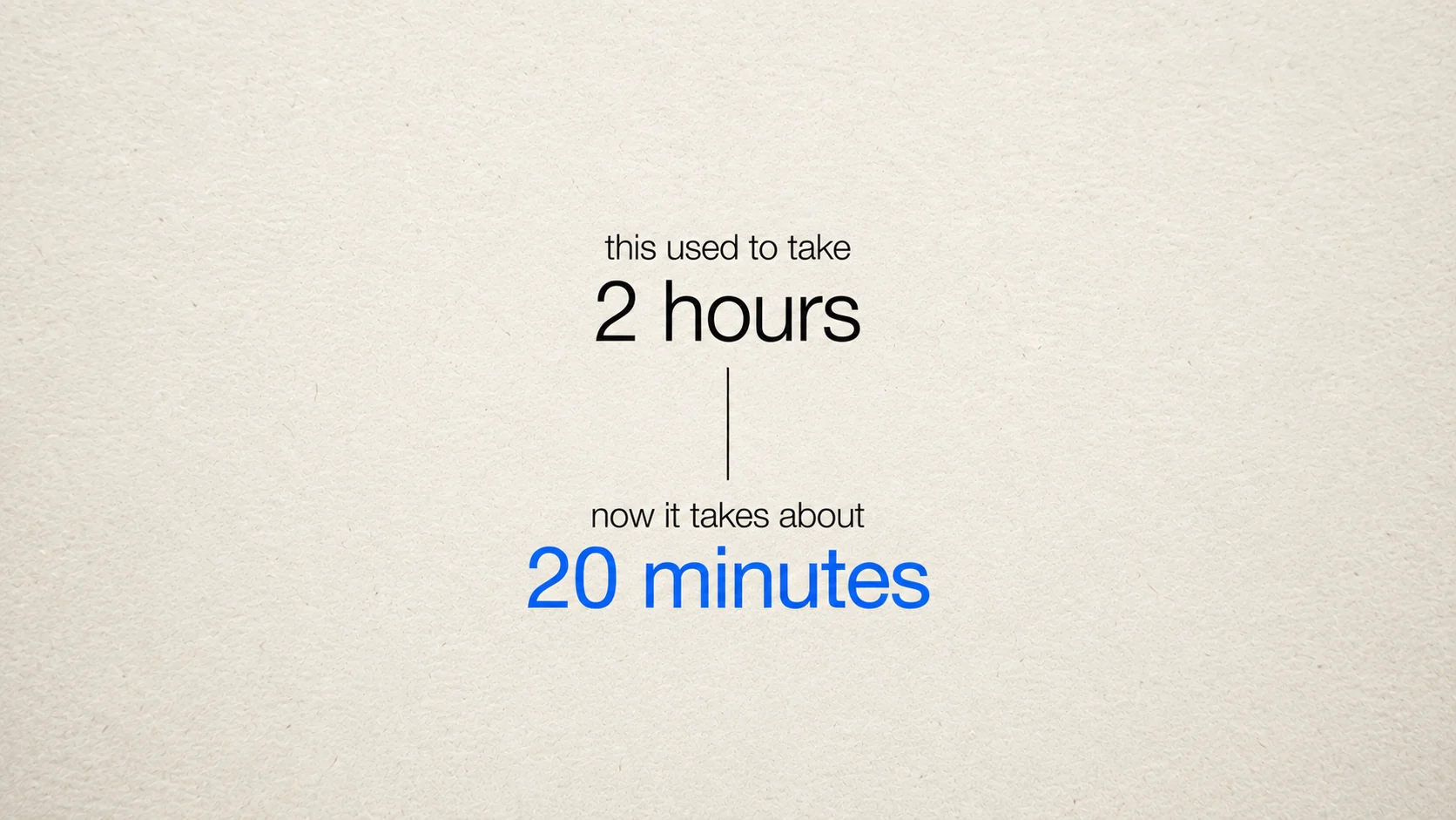
From two hours to twenty minutes

A vertical editorial comparison built from type, spacing, and one dividing line.

Two hours compared with twenty minutes motion graphic

Final generated frameView full size ↗

Image prompt
Create the finished 16:9 end frame for a cinematic time-comparison motion graphic.

Use warm white uncoated paper with clearly visible fine fibers, subtle tonal variation, and soft overhead light. Add fine 35mm grain and gentle optical softness while keeping the type crisp.

Build one centered vertical composition. Set “this used to take” in small regular-weight near-black Helvetica with “2 hours” larger beneath it. Separate the two values with one thin vertical near-black line. Below it, set “now it takes about” in the same small type and “20 minutes” larger in cobalt blue. Keep every line centered and use generous vertical spacing.

The frame should read as an editorial comparison, not a productivity advertisement. Use only typography and the dividing line; include no dot, arrow, chart, badge, icon, or panel.
04

Workflow · 8 seconds

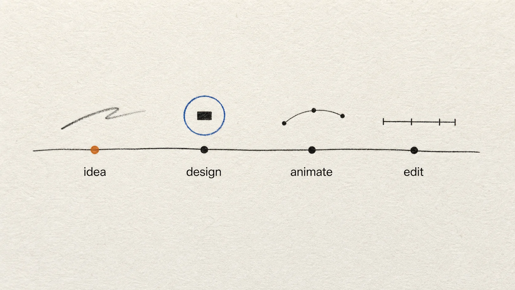
Idea, design, animate, edit

A four-stage path that turns a working diagram into a compact editorial sequence.

Idea design animate edit workflow graphic

Final generated frameView full size ↗

Image prompt
Create the finished 16:9 end frame for a cinematic workflow motion graphic.

Use warm white uncoated paper with visible fine fibers, a lightly toothy surface, slight tonal unevenness, and soft raking light. Add fine 35mm film grain and restrained optical softness.

Center one gently curved near-black ink line across the middle of the frame. Place four evenly spaced points on the line and label them “idea”, “design”, “animate”, and “edit” in lowercase Helvetica, regular weight. Keep the full workflow grouped around the center of the frame.

Above each point, use one simple editorial mark instead of a card: a loose pencil stroke for “idea”, a cobalt circle aligned with a black rectangle for “design”, a curved path with three dots for “animate”, and one short timeline bar for “edit”. Place one muted-orange marker at the “idea” point.

Allow the line and pencil mark to retain slight analog irregularity while the lowercase Helvetica labels remain clean. The frame should feel like an editor’s working diagram refined for a film, not a corporate process chart. Avoid cards, panels, arrows, interface styling, and extra decoration.
05

Screenshot transformation · 6 seconds

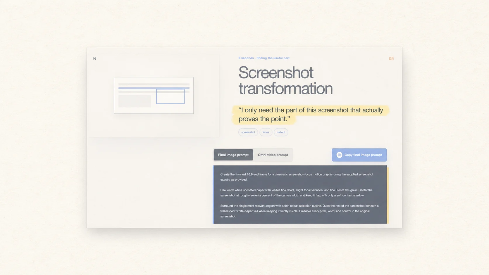
Finding the useful part

A real screenshot recedes while a warm highlight isolates the sentence that matters.

Screenshot transformation with highlighted sentence

Final generated frameView full size ↗

Image prompt
Create the finished 16:9 end frame for a cinematic screenshot-focus motion graphic using the supplied screenshot exactly as provided.

Use warm white uncoated paper with visible fine fibers, slight tonal variation, and fine 35mm film grain. Center the screenshot at roughly seventy percent of the canvas width and keep it flat, with only a soft contact shadow.

Cover the single most relevant region which says “I only need the part of this screenshot that actually proves the point.” with a soft translucent muted-yellow highlight, as if a broad highlighter passed over the surface. Keep the content beneath it crisp and fully readable, with slightly feathered edges and a restrained warm glow. Quiet the rest of the screenshot beneath a translucent white-paper veil while keeping it faintly visible. Preserve every pixel, word, and control in the original screenshot.

Let the real screenshot provide the detail. Include no box outline, dot, headline, label, annotation card, invented interface, extracted duplicate, or presentation panel.
06

Story timeline · 8 seconds

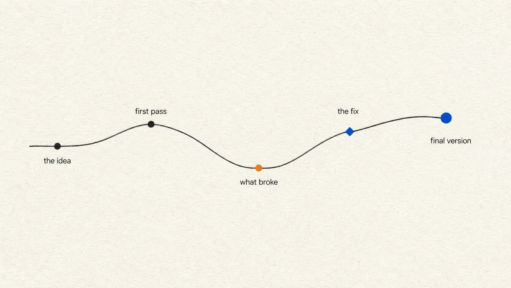
From the idea to the final version

A narrative path that dips at what broke and recovers through the fix.

Story timeline from idea through final version

Final generated frameView full size ↗

Image prompt
Create the finished 16:9 end frame for a cinematic story-timeline motion graphic.

Use warm white uncoated paper with visible fine fibers, faint pressure marks, subtle tonal variation, and soft overhead light. Add fine 35mm grain and restrained optical softness.

Center one continuous near-black ink path across the middle of the frame. Let it begin level at “the idea”, rise slightly at “first pass”, fall into a clear low point at “what broke”, then recover through “the fix” and end higher at “final version”. Keep the entire path visible at once.

Use small near-black circles for the first two points, a muted-orange circle at “what broke”, a cobalt diamond at “the fix”, and a slightly larger cobalt circle at “final version”. Set every label in lowercase Helvetica, regular weight, close to its point and alternate labels above and below the line. Keep the full graphic centered with generous white space above and below.

Let the ink path look slightly imperfect while the lowercase Helvetica labels remain clean. The frame should feel like a story unfolding in a video essay, not a business roadmap. Avoid cards, flags, arrows, grids, charts, and extra captions.
07

Designed list · 6 seconds

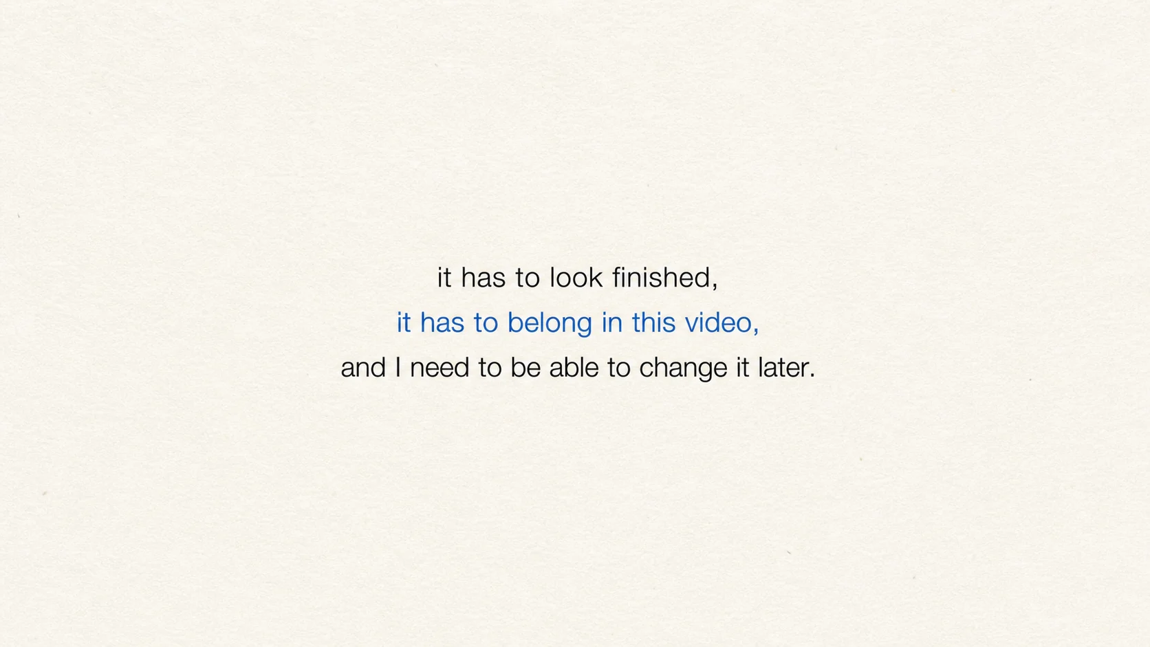
It has to belong in the video

Three lines treated as one continuous thought rather than a collection of slogans.

Three-line designed typography list

Final generated frameView full size ↗

Image prompt
Create the finished 16:9 end frame for a restrained cinematic typography sequence.

Use warm white uncoated paper with visible fine fibers, a softly toothy surface, slight tonal variation, and a few tiny natural flecks. Add fine 35mm film grain, gentle highlight roll-off, and subtle optical softness while keeping the typography crisp.

Set this single thought as three centered lines in Helvetica Neue or Helvetica: “it has to look finished,” / “it has to belong in this video,” / “and I need to be able to change it later.” Use regular-weight near-black type for the first and third lines. Set the middle line in cobalt blue at medium weight without increasing its size. Keep all three lines on one central axis with calm, even spacing, and contain the text within the middle fifty-five percent of the frame.

The image should feel like the resolved final frame of an editorial film sequence, not three separate statements or a motivational poster. Use only typography, paper texture, and negative space. Include no underline, dot, number, icon, box, panel, or decorative shape.
08

Vector study · 6 seconds

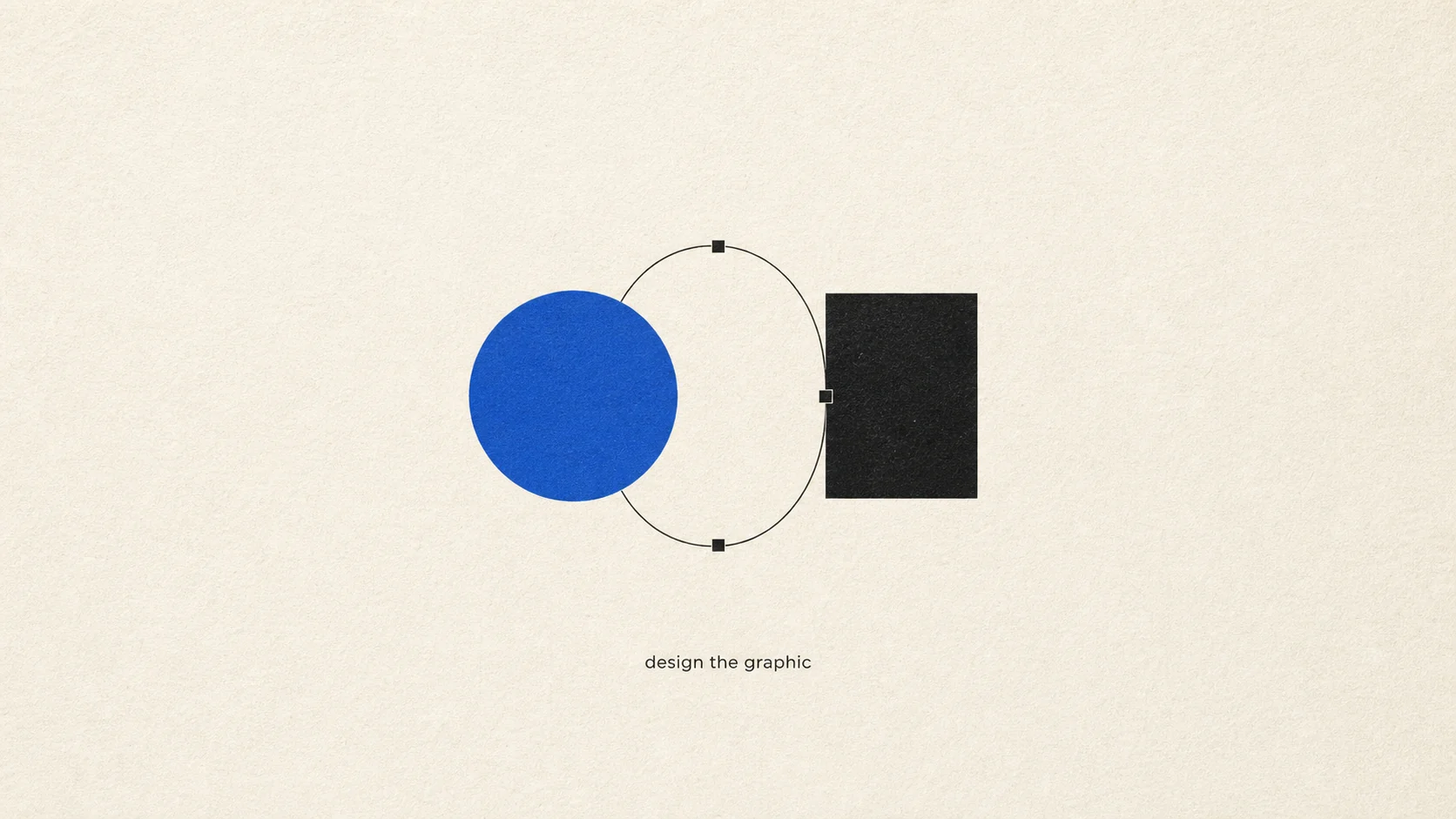
Design the graphic

Simple geometry and an ink-like connector establish the design before it moves.

Cobalt circle and black rectangle vector design study

Final generated frameView full size ↗

Image prompt
Create the finished 16:9 end frame for a cinematic editorial motion graphic about designing graphics and diagrams.

Use warm white uncoated paper with visible fine fibers, a lightly toothy surface, subtle tonal variation, soft overhead light, fine 35mm film grain, and restrained optical softness.

Center one clean design composition in the middle of the frame: a cobalt circle, a near-black rectangle, and a thin curved near-black connector arranged as a simple balanced diagram. Add three small square anchor points on the curve so it reads immediately as a designed vector path. Beneath the composition, set the small lowercase label “design the graphic” in regular-weight near-black Helvetica.

Keep the shapes precise but let the connector retain a faint ink-like irregularity. The frame should feel like a refined design-study end frame, not a software interface. Include no cursor, toolbar, grid, extra icons, cards, arrows, or decorative elements.
09

Motion path · 6 seconds

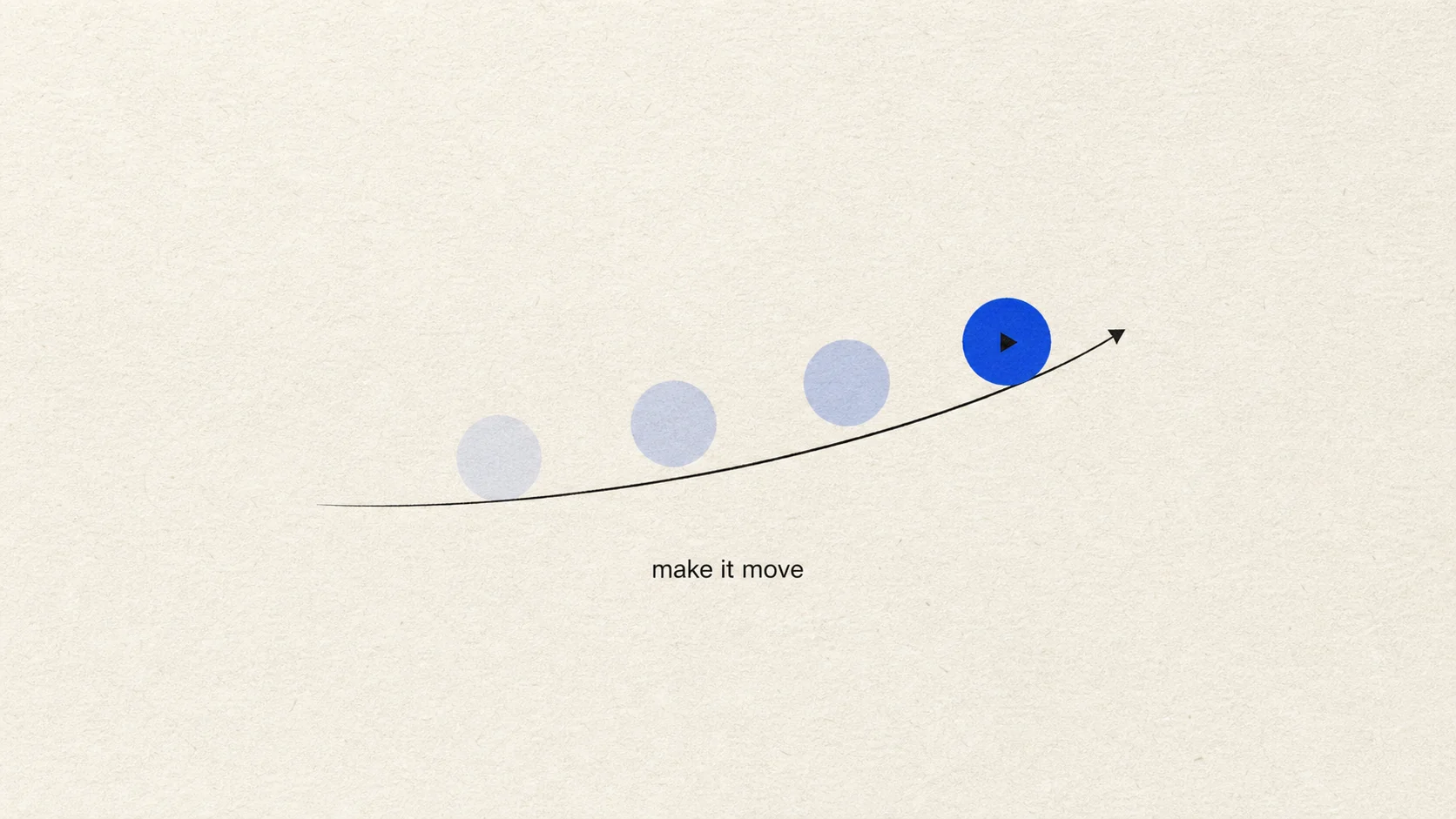
Make it move

A single circle travels one rising curve and leaves three quiet echoes behind.

Circle traveling along a curved motion path

Final generated frameView full size ↗

Image prompt
Create the finished 16:9 end frame for a cinematic motion graphic about transforming a static design into movement.

Use the same warm white uncoated paper, visible fibers, fine 35mm grain, soft light, and restrained optical softness.

Center one cobalt circle slightly right of center with three pale cobalt echo positions trailing behind it along a smooth rising curve. Draw the motion path as one thin near-black curved line with a small arrowhead at the end. Place a tiny near-black play triangle inside the solid final circle. Beneath the path, set “make it move” in lowercase regular-weight Helvetica.

The final frame should communicate motion through one object and one path. Keep substantial empty space around it. Include no timeline, interface, extra shapes, speed lines, particles, or decorative symbols.
10

AI-assisted workflow · 8 seconds

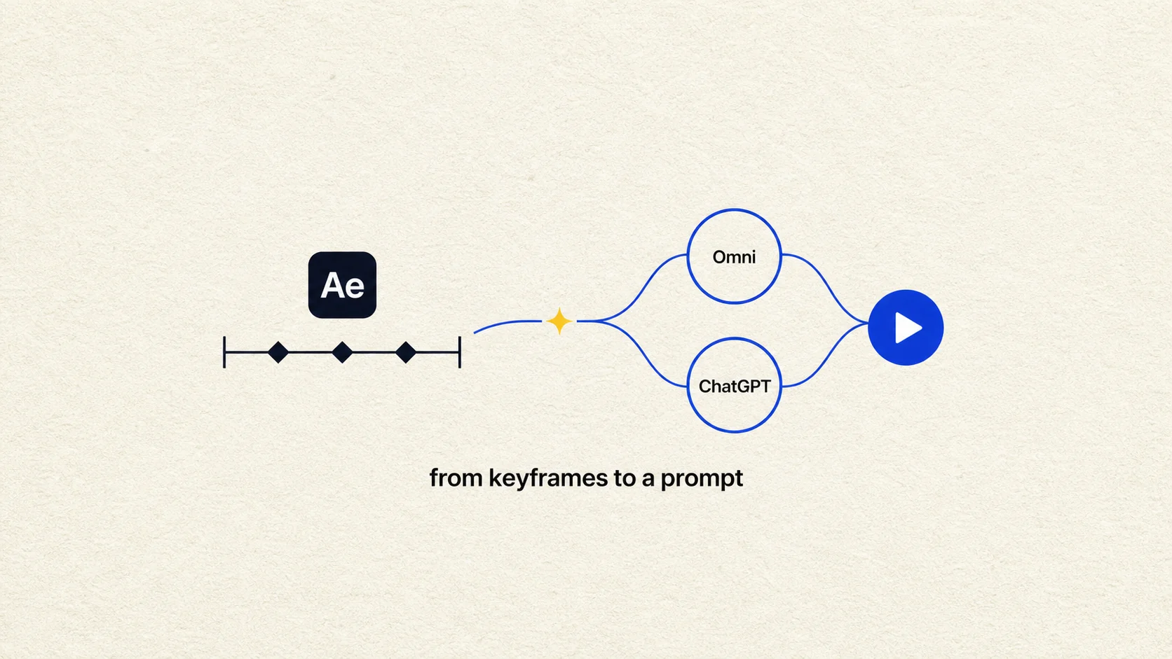
From keyframes to a prompt

Manual keyframes give way to a prompt-led path and a finished play state.

After Effects keyframes flowing through Omni and ChatGPT to a play button

Final generated frameView full size ↗

Image prompt
Create the finished 16:9 end frame for a cinematic workflow graphic contrasting manual keyframe work with an AI-assisted animation path.

Use warm white textured paper with visible fibers, subtle tonal variation, fine 35mm film grain, and soft overhead light.

Build one centered horizontal transformation. On the left, place a small near-black rounded square labeled “Ae” above a short timeline containing only three diamond keyframes. In the center, draw one thin curved cobalt connector passing through a small warm-yellow sparkle. On the right, place two simple cobalt-outlined circles labeled “Omni” and “ChatGPT”, feeding into one solid cobalt play circle. Set the small lowercase caption “from keyframes to a prompt” beneath the full composition.

Keep the diagram compact and editorial. Use only these essential symbols and labels; do not imitate a full software interface or exact corporate logos. Include no windows, panels, cursor, code, extra sparkles, robots, or background decoration.
11

Reaction · 5 seconds

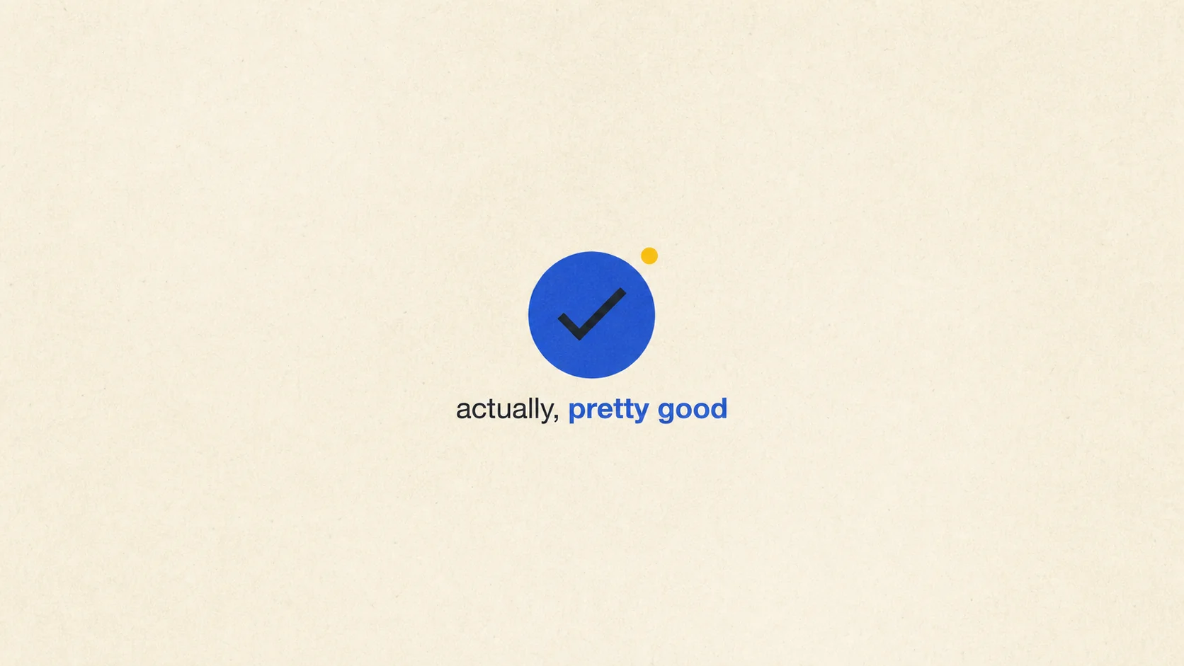
Actually, pretty good

A modest checkmark reaction that stays confident without becoming celebratory.

Actually pretty good checkmark reaction graphic

Final generated frameView full size ↗

Image prompt
Create the finished 16:9 end frame for a quiet cinematic reaction graphic.

Use warm white uncoated paper with fine fibers, soft overhead light, visible 35mm grain, and gentle optical softness.

Center one cobalt circle containing a clean near-black checkmark. Place a small warm-yellow dot just outside the circle at the upper right. Beneath it, set “actually, pretty good” in lowercase Helvetica, with “pretty good” in cobalt medium weight and the remaining words in near-black regular weight.

Keep the composition modest and confident rather than celebratory. Use generous negative space. Include no stars, confetti, rating scale, emoji, badge, panel, or additional symbols.
12

Problem reveal · 6 seconds

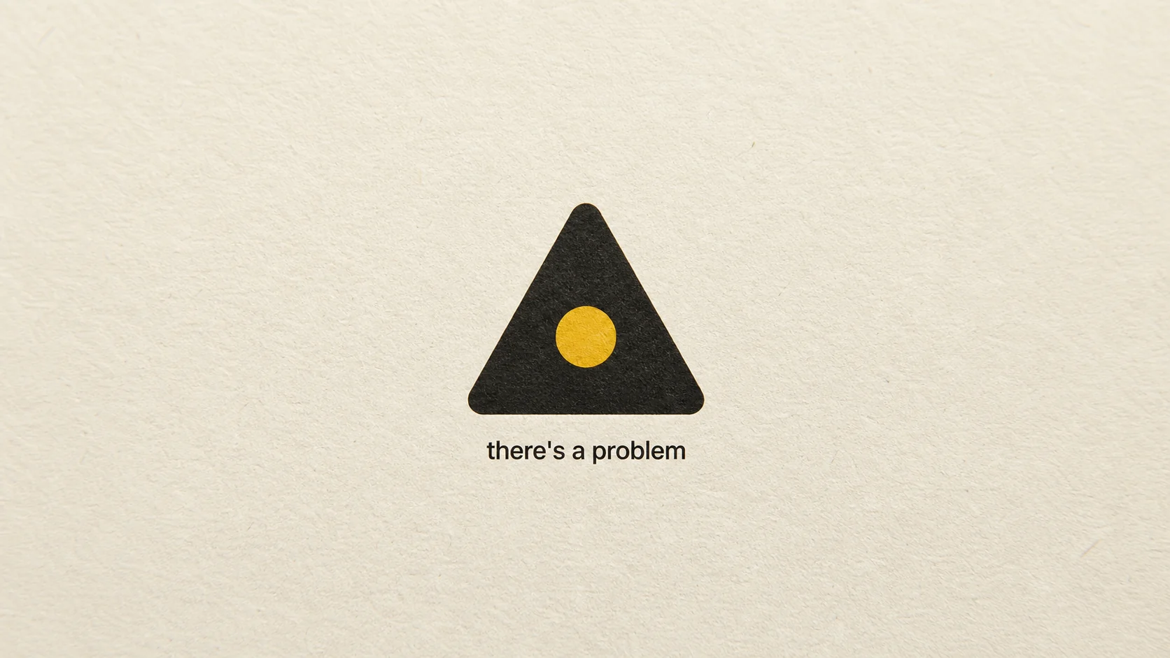
There’s a problem

A clean tension beat built from a softened warning form and one yellow center.

There is a problem warning triangle graphic

Final generated frameView full size ↗

Image prompt
Create the finished 16:9 end frame for a cinematic problem reveal.

Use warm white uncoated paper with visible fibers, faint pressure marks, fine 35mm grain, soft raking light, and restrained optical softness.

Center one simple near-black warning triangle with rounded corners. Place a single warm-yellow circular dot inside it instead of an exclamation mark. Beneath the symbol, set “there’s a problem” in compact lowercase near-black Helvetica.

The frame should feel like a clean chapter beat with slight tension, not an emergency alert. Include no red, flashing light, extra text, border, panel, glitch, noise burst, or additional icons.
13

Rigid code motion · 6 seconds

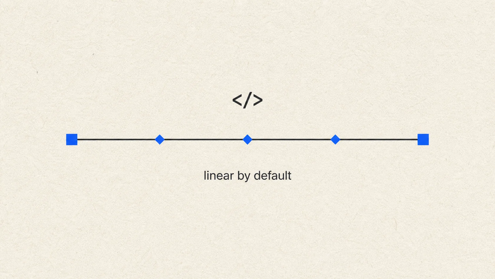
Linear by default

Constant speed and evenly spaced keyframes deliberately demonstrate mechanical movement.

Linear by default code and keyframe diagram

Final generated frameView full size ↗

Image prompt
Create the finished 16:9 end frame for a cinematic editorial diagram about rigid linear animation made with HTML code.

Use warm white textured paper with visible fine fibers, subtle tonal variation, fine 35mm grain, and soft overhead light.

Center one perfectly straight horizontal near-black line with a cobalt square at the left endpoint and the same cobalt square at the right endpoint. Place three evenly spaced small diamond keyframes on the line. Above the center, set a compact near-black code symbol “</>”. Beneath the line, set the lowercase label “linear by default” in regular-weight Helvetica.

Make the geometry intentionally rigid and evenly spaced. Keep the rest of the frame empty. Include no browser window, code block, cursor, graph, multiple tracks, extra brackets, or decorative shapes.
14

Two-frame rejection · Two-image sequence

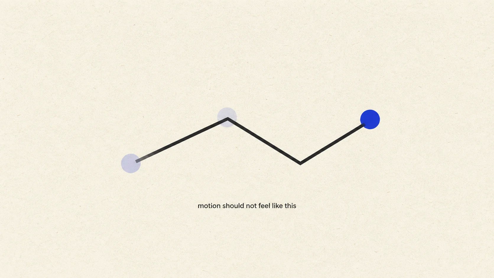
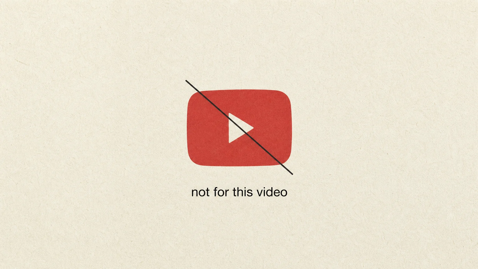
Motion should not feel like this

An awkward angular path transitions into a calm rejection of unsuitable YouTube motion.

Image 1
Stuttering circle on an angular path
Image 2
Not for this video rejection graphic

Final generated framesView full size ↗

Image 1 prompt
Create the finished 16:9 end frame for a cinematic comparison showing motion that lacks fluidity.

Use warm white uncoated paper with visible fibers, fine 35mm film grain, gentle tonal roll-off, and restrained optical softness.

Center one cobalt circle caught on a near-black motion path made of three stiff angular segments. Show two faint previous positions of the circle behind it, unevenly spaced, so the motion reads as a visible stutter. Place the small lowercase caption “motion should not feel like this” beneath the path in near-black Helvetica.

Keep the comparison implicit and focused on this single awkward path. Include no second diagram, chart, interface, warning icon, speed lines, particles, or extra text.
15

Hero curve · 7 seconds

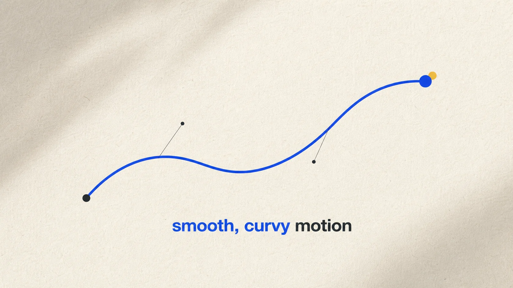
Smooth, curvy motion

A relaxed Bézier path closes the sequence with a clear argument for fluid motion.

Smooth curvy motion Bezier path graphic

Final generated frameView full size ↗

Image prompt
Create the finished 16:9 end frame for a cinematic hero motion graphic celebrating smooth, curved movement.

Use warm white uncoated paper with clearly visible fine fibers, faint pressure marks, soft raking light, fine 35mm film grain, and restrained optical softness.

Center one elegant cobalt Bézier curve sweeping upward across the middle of the frame in a relaxed S shape. Place a near-black circle at the beginning, a solid cobalt circle at the end, and two small near-black anchor points with very thin tangent handles along the curve. Add one tiny warm-yellow marker resting just behind the final circle. Beneath the composition, set “smooth, curvy motion” in lowercase Helvetica, with “smooth, curvy” in cobalt medium weight.

Make the curve the hero and keep the frame open and tactile. The geometry should feel designed but not sterile. Include no grid, interface, extra paths, particles, speed lines, arrows, or decorative symbols.