Logo animation prompt archive · made by Jack

Nine identities.
Nine ways in.

Finished animations, exact prompts, and the real brands behind every identity.09 / 18
Beautiful Contradictions logo
The Executors logo
Lady Venus Astrology logo
Two clocks logo

Identity in motion

Nine logos, each animated its own way.

Press play to watch each finished reveal, meet the brand behind it, or copy the exact image and video prompts. Videos load only when you choose to watch.
01

Luxury spiritual brand · 7 seconds

Beautiful Contradictions

A radiant gold lotus medallion, sacred geometry, and a restrained cinematic reveal.
Beautiful Contradictions gold lotus logo
Final identity frameFull-size still ↗
Image prompt
Use case: logo-brand
Asset type: finished luxury logo presentation
Input images: Image 1 is the strict composition and appearance reference. Reproduce it as faithfully as possible.

Create a wide 16:9 luxury spiritual-brand logo on a nearly black plum-purple background with an extremely subtle smoky burgundy glow concentrated behind the artwork.

On the left, place a large circular medallion occupying roughly 36% of the canvas width. Give it a thin, intensely luminous double-gold rim with a soft amber aura. Inside the upper half, use a deep midnight-violet celestial field containing tiny gold stars, faint blue-purple constellations, and many fine radial gold rays converging behind a central lotus. Fill the lower half with an intricate gold “flower of life” sacred-geometry pattern.

Center a symmetrical, layered golden lotus inside the circle. Use approximately three tiers of pointed petals, bright gold outlines, dark bronze-gold outer petals, and brilliantly illuminated yellow-gold central petals with delicate embossed ornamental texture. Extend the lowest central petal downward. Add three vertically aligned glowing gold circles above the lotus, decreasing in size toward the lotus. Make the entire emblem radiant, intricate, mystical, and refined.

On the right, render the exact two-line text:
“Beautiful”
“Contradictions”

Use a very large, thin, high-contrast classical Didone serif similar to Didot or Bodoni. Use title case, metallic antique-gold letterforms, subtle beveled highlights, and a restrained amber outer glow. Center the first line above the second; make “Contradictions” wider.

Below the wording, place a tiny outlined gold lotus at center with a thin horizontal gold rule extending to each side.

Composition: emblem centered vertically around x=24%; wording centered around x=68%; generous outer margins; no cropping.
Palette: black plum, deep violet, burgundy haze, antique gold, amber, tiny violet-blue stars.
Constraints: reproduce the reference layout, wording, capitalization, proportions, ornamentation, and spacing exactly.
Avoid: extra text, misspellings, modern sans-serif type, people, photographic scenery, silver, green, watermark, border, mockup, perspective distortion.
2,223 charactersOne click copies the complete prompt
02

Sports-media wordmark · 6 seconds

The Executors

A hard-driving red monogram and tightly controlled athletic typography.
The Executors with Uzair Khan sports logo
Final identity frameFull-size still ↗
Image prompt
Use case: logo-brand
Asset type: finished sports-media wordmark
Input images: Image 1 is the strict composition and appearance reference. Reproduce it as faithfully as possible.

Create a clean, high-impact 16:9 logo presentation on a pure white background.

On the left, place an enormous custom geometric capital “E,” slightly tilted and leaning dynamically to the right. Construct it from sharp angular red planes with pointed right-facing terminals. Use a vivid red-to-crimson gradient, subtle surface shading, and a narrow black extruded layer offset down and left, creating shallow 3D depth. The symbol should occupy about the left third of the canvas and nearly 75% of its height.

On the right, create the exact stacked typography:
“THE”
“EXECUTORS”
“WITH UZAIR KHAN”

Place “THE” in small, condensed, bold italic black capitals above the left side of “EXECUTORS.” Render “EXECUTORS” in extremely large, heavy, condensed, slightly italic uppercase black lettering. Use a tall athletic display typeface with tightly spaced characters, rounded exterior corners, and sharp internal cuts. Add extremely subtle charcoal texture or shading without changing the predominantly black appearance.

Under “EXECUTORS,” draw one thin horizontal red rule spanning almost the full word width. Beneath the rule, render “WITH UZAIR KHAN” in smaller black uppercase sans-serif letters with very wide tracking.

Composition: oversized red E on the left; typography block beginning near the center and extending toward the right edge; all elements vertically balanced.
Palette: pure white, vivid red, crimson, near-black.
Constraints: render every word exactly once and spell “EXECUTORS” and “UZAIR KHAN” exactly. Preserve the reference hierarchy, angles, scale, alignment, and spacing.
Avoid: extra words, decorative background, drop shadows on the white field, rounded E symbol, additional colors, people, watermark, border, mockup.
1,922 charactersOne click copies the complete prompt
03

Educational identity · 6 seconds

The INRIS Files

A folder-and-lightbulb mark drawn in with crisp, approachable timing.
The INRIS Files educational website logo
Final identity frameFull-size still ↗
Image prompt
Use case: logo-brand
Asset type: educational website logo presentation
Input images: Image 1 is the strict composition and appearance reference. Reproduce it as faithfully as possible.

Create a minimalist logo presentation on a clean white 2100×1200 canvas.

On the left, place a large golden-yellow square measuring approximately half the canvas height. Center a simple black-outlined folder-and-lightbulb illustration inside it.

The folder should be drawn with thick, smooth, rounded black linework. Show a white rear sheet or inner panel and a yellow front folder flap. Place a large white lightbulb directly above and partially overlapping the folder. Give the bulb a very thick black outline, a black-and-white screw base, two simple black filament terminals, and seven short black radiating idea lines. Add a small yellow semicircular glow immediately beneath the bulb base.

On the right, render this exact stacked text:
“The”
“INRIS”
“Files”

Use bold black sans-serif typography similar to Arial Black or Helvetica Neue Heavy. “The” is large but smaller than “INRIS.” “INRIS” is uppercase and very heavy. “Files” is title case and approximately the same visual width as “INRIS.”

Below the stack, aligned toward its left edge, render:
“.com”

Use smaller but still very bold black sans-serif type.

Composition: the yellow icon square occupies the left-center; the typography block sits immediately to its right; the combined logo is centered horizontally and vertically with extensive white margins.
Palette: white, black, vivid golden yellow approximately #FFC400.
Style: flat vector-like graphics, clean educational identity, no dimensional effects.
Constraints: exact wording and capitalization: “The”, “INRIS”, “Files”, “.com”. Preserve the line breaks and relative scale.
Avoid: gradients, shadows, 3D, thin outlines, additional icons, extra text, gray background, watermark, border, mockup.
1,908 charactersOne click copies the complete prompt
04

Technology identity · 6 seconds

Rithvik

A metallic monogram assembled inside a precise teal editing frame.
Rithvik video editing technology logo
Final identity frameFull-size still ↗
Image prompt
Use case: logo-brand
Asset type: premium technology identity presentation
Input images: Image 1 is the strict composition and appearance reference. Reproduce it as faithfully as possible.

Create a polished 16:9 technology-brand logo on a nearly black charcoal background with subtle fine grain and an understated central vignette.

Add a very thin, low-contrast futuristic circuit-style border close to all four edges. Use clipped angular corners and segmented lines in muted dark teal. Add one tiny cyan dot near the lower-left border and one tiny coral-red dot near the upper-right border. Include faint diagonal line accents in the extreme upper-right and lower-left corners.

On the left-center, create a square monogram emblem. Form an open teal rectangular frame with squared corners, leaving a gap on the right side. Inside it, place a large stylized metallic-silver capital “R.” The R should have a broad geometric upper bowl and a long diagonal leg extending to the lower right. Make the lower-right section of the teal frame terminate in a pointed triangular fold.

Inside the right-side gap of the frame, add a thin vertical coral-red line with a small rectangular block crossing its center.

To the right of the emblem, render the exact word:
“Rithvik”

Use a very large, bold geometric sans-serif typeface. Capitalize only the first letter. Apply a restrained brushed-silver or white-metal gradient with subtle beveling and soft highlights. Keep the lettering clean and highly legible.

Composition: monogram centered near x=23%; wordmark begins around x=38% and runs across the center-right; both elements vertically centered.
Palette: charcoal black, metallic silver-white, muted cyan-teal, small coral-red accents.
Constraints: preserve exact spelling, capitalization, monogram construction, border details, proportions, alignment, and negative space.
Avoid: extra text, blue neon glow, strong lens flare, excessive 3D depth, bright background, additional icons, watermark, mockup.
1,998 charactersOne click copies the complete prompt
05

Minimal technology wordmark · 6 seconds

VERTISO

A coral ring and integrated V resolve into a crisp, restrained wordmark.
VERTISO coral and white technology wordmark
Final identity frameFull-size still ↗
Image prompt
Use case: logo-brand
Asset type: minimalist technology wordmark
Input images: Image 1 is the strict composition and appearance reference. Reproduce it as faithfully as possible.

Create a minimalist 16:9 logo presentation on a solid near-black charcoal background approximately #101115.

Center a compact horizontal logo group slightly above the exact vertical midpoint.

At the left of the wordmark, create a coral-red circular emblem approximately the same height as the letters. Use a thick open circular ring with a subtle red-orange tonal gradient. Integrate a sharp uppercase “V” into the ring: the left diagonal stroke begins above the circle and descends steeply through its interior; the right diagonal stroke rises from the bottom interior toward the upper right. Use thick, clean coral-red strokes with squared or sharply cut terminals.

Immediately to the right, render the remaining letters:
“ERTISO”

Together, the emblem and letters must read visually as “VERTISO.” Use a clean, thin-to-medium geometric sans-serif typeface, uppercase, with restrained tracking. Set the letters in soft white or very light gray. Add a subtle horizontal gray motion-blur trail extending leftward from the first white “E,” appearing behind the red circular emblem. Keep all other letters sharp.

Composition: complete logo group centered horizontally; approximately 44% of canvas width; generous empty black space on every side.
Palette: near-black, coral red approximately #FF4C3F, soft white, faint neutral gray.
Constraints: exact visual spelling “VERTISO”; crisp centered alignment; preserve emblem proportions and understated motion streak.
Avoid: extra wording, glow, heavy shadows, beveling, glossy 3D treatment, additional colors, border, watermark, mockup.
1,761 charactersOne click copies the complete prompt
06

Monochrome studio wordmark · 5 seconds

Working Creatives

Two outlined initials create a diagonal structure for a pure black-and-white reveal.
Working Creatives black and white studio logo
Final identity frameFull-size still ↗
Image prompt
Use case: logo-brand
Asset type: monochrome creative-studio wordmark
Input images: Image 1 is the strict composition and appearance reference. Reproduce it as faithfully as possible.

Create a stark monochrome 16:9 logo on a pure black background.

Use two overlapping thin white outline squares as the structural motif:
Place the upper square toward the left-center. Its interior contains a very large bold white uppercase “W.”
From the right side of that square, continue the word “orking” in a lighter-weight white sans-serif, forming the complete word “Working.”

Position a second outline square lower and to the right so its upper-left corner touches or overlaps the lower-right corner of the W square.
Place a very large bold white uppercase “C” inside the second square.
Continue the word “reatives” to the right of that square in the same lighter-weight sans-serif, forming “Creatives.”

The first line should read “Working.” The second line should read “Creatives.” The two boxed initials form a diagonal stair-step arrangement, with the second square starting directly below the junction of the first square and the word “Working.”

Typography: clean modern sans-serif similar to Helvetica or Arial; boxed W and C are extra-bold; remaining letters are regular or light weight. Use pure white with a faint natural antialiased softness.

Composition: combined logo centered on the canvas, occupying roughly two-thirds of its width; “Working” above and “Creatives” below; generous black negative space.
Constraints: exact spelling and capitalization; preserve the two-square overlap, hierarchy, line breaks, and alignment.
Avoid: extra words, gray background, colored accents, gradients, glow, 3D, serif type, icons, watermark, outer border, mockup.
1,757 charactersOne click copies the complete prompt
07

Hand-drawn identity · Organic draw-on

two clocks

An organic line drawing preserves every wobble and handmade imperfection.
Two clocks hand drawn logo
Final identity frameFull-size still ↗
Image prompt
Use case: logo-brand
Asset type: hand-drawn minimalist logo
Input images: Image 1 is the strict composition and appearance reference. Preserve its handmade imperfections.

Create a minimalist 16:9 black-ink drawing on a plain warm-white paper background.

Draw one very large, imperfect hand-sketched circle centered on the canvas. Use a thin black wax-pencil or dry graphite line with visible wobble, grain, doubled marks, and inconsistent pressure. Do not make the circle geometrically perfect.

Inside the circle, create the words “two clocks” as an intentionally primitive handwritten clock illustration:
Near the upper-right interior, write “tw” in thin, narrow, irregular lowercase handwriting.
Replace the “o” in “two” with a small hand-drawn circular clock face.
Inside that small clock, draw two tiny black hands meeting near the center and pointing approximately upward and to the right.

Across the lower middle, write “clocks” in the same tall, thin, irregular lowercase handwriting.
Transform the tall “k” area into a second abstract clock: one very long vertical hand rising almost to the upper center and one diagonal hand pointing up and right. The hands meet around the middle of the word.

Keep all marks monochrome black and visibly handmade, like a quick notebook sketch scanned onto white paper.

Composition: one oversized circle occupying roughly half the canvas height; artwork centered with wide white margins.
Constraints: preserve the awkward handwritten character, approximate positions, thin dry texture, and lowercase wording.
Avoid: polished typography, perfect vector lines, numerals, tick marks, color, shading, gradients, extra objects, drop shadow, watermark, border, mockup.
1,710 charactersOne click copies the complete prompt
08

Celestial identity · 6 seconds

Lady Venus Astrology

A luminous crescent, restrained lavender atmosphere, and elegant masked wordmark reveal.
Lady Venus Astrology crescent moon logo on an indigo star field
Final identity frameFull-size still ↗
Image prompt
Use case: logo-brand
Asset type: finished astrology-brand logo presentation
Input images: Image 1 is the strict composition and appearance reference. Reproduce its layout, colors, proportions, typography, and spacing as faithfully as possible.

Create a wide 16:9 celestial logo on a dense, realistic star-field background. Fill the entire canvas with deep midnight navy and near-black space, containing hundreds of tiny, naturally scattered white and pale-blue stars. Stars should vary subtly in size and brightness, with only a few slightly brighter points. Do not form visible constellations.

Introduce a soft purple-violet nebula glow across the left third of the image. Make it brightest near the lower-left corner and behind the crescent moon, fading smoothly into the dark navy background toward the center. Keep the upper-right and far-right regions predominantly dark blue-black.

On the left-center, place one large, perfectly smooth white crescent moon. The crescent should be vertically oriented, with both sharp tips pointing toward the upper-left and lower-left. Its convex outer edge curves strongly to the right, while its concave inner cutout opens toward the left. Make the upper tip slightly longer and narrower than the lower tip. Use a solid luminous white fill with a soft lavender-white halo and no visible surface texture, craters, outline, or facial features.

The crescent should occupy roughly 23% of the canvas width and 38% of its height. Center it near x=21% and y=51%, with ample space from every edge.

To the right of the crescent, render the exact two-line text:
“Lady Venus”
“Astrology”

Use a clean, modern, light-weight geometric sans-serif similar to Avenir Light, Century Gothic, or Montserrat Light. Use soft white lettering with no outline and only an extremely subtle cool-white glow.

Set “Lady Venus” on the first line in large title case. Set “Astrology” directly below it, also in title case, approximately 82% of the first line’s font size. Align both lines to the same left edge. Use generous but natural letter spacing. Keep the two lines centered vertically as one block.

Composition: crescent centered around x=21%; text block begins around x=38% and extends toward x=88%; first line centered near y=46%; second line centered near y=61%. Preserve the broad celestial negative space above and around the logo.

Color palette: near-black, midnight navy, indigo, violet, lavender, luminous white, tiny pale-blue stars.
Lighting and mood: serene, mystical, feminine, elegant, cosmic, uncluttered.
Text accuracy: render “Lady Venus” and “Astrology” exactly once, with the exact spelling, capitalization, and line break shown. Do not merge the two lines or add punctuation.

Constraints: reproduce the reference image’s crescent direction, scale, star density, purple glow placement, typography weight, text hierarchy, alignment, and spacing. Maintain a clean finished-logo appearance.

Avoid: additional moons, planets, zodiac symbols, astrology charts, constellation lines, people, faces, clouds, galaxies, colorful nebulae, gold, decorative serif typography, bold lettering, italics, extra text, watermark, border, mockup, 3D extrusion, lens flare, or foreground objects.
3,221 charactersOne click copies the complete prompt
09

SaaS monogram · 7–8 seconds

Rukhsana Khan

A connected cobalt monogram assembled through precise geometric lines and restrained light.
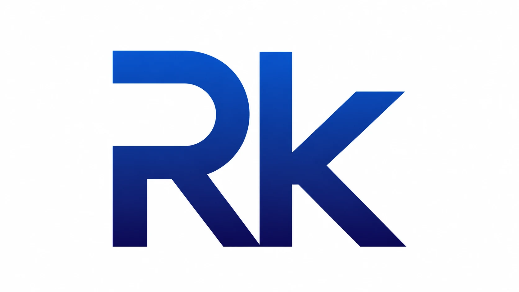
Rukhsana Khan blue Rk monogram on white
Final identity frameFull-size still ↗
Image prompt
Create a minimalist, high-resolution 16:9 logo graphic on a pure white background.

Display one large, centered geometric monogram reading exactly “Rk”. Construct it as a custom, ultra-bold sans-serif mark with an uppercase R on the left and a lowercase k on the right.

The uppercase R has a thick vertical stem, two flat horizontal strokes extending rightward, and a broad rounded outer bowl. Its inner counter is a large horizontal capsule-like white opening with a flat left side and a smoothly rounded right end. From the lower-right curve of the bowl, a thick diagonal leg descends toward the center-bottom.

Place the lowercase k immediately beside the R. Give it a tall, thick vertical stem equal in height to the R. Align this stem closely with the end of the R’s diagonal leg so the two letters form one visually connected monogram. From the middle of the k stem, extend two thick diagonal arms toward the upper-right and lower-right. Finish both arms with clean angled cuts. Keep the R and k clearly distinguishable and instantly readable.

Apply a smooth vertical gradient across the entire monogram: vivid cobalt blue at the top, royal blue through the middle, and very deep indigo navy at the bottom. Use perfectly flat, vector-like color with no texture.

Center the complete monogram both horizontally and vertically. It should occupy approximately 56% of the canvas width and 67% of its height, with wide, balanced white margins. Use razor-sharp geometric edges, uniform stroke weight, precise alignment, clean optical spacing, and a premium modern SaaS-brand aesthetic.

Exact text: “Rk”

Output: pristine flat logo artwork, true 16:9 widescreen composition, ultra-high resolution.

Do not add any other text, letters, symbols, tagline, border, shadow, glow, bevel, embossing, reflection, outline, texture, grain, noise, mockup, perspective, background pattern, watermark, or decorative element. Do not crop, rotate, separate, duplicate, distort, or make the “Rk” monogram abstract or difficult to read.
2,021 charactersOne click copies the complete prompt

Download the animations

Want the finished files?

Open the shared Google Drive folder to download the available logo animation files.
Open the download folder